Color Palette
Overview
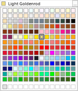
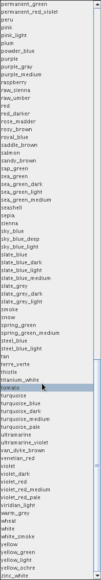
Users select colors from a drop-down menu of 196 color names sorted in alphabetical order.
Problem
- Users have to use their memories to imagine what the colors look like just from the names.
- Substantial scrolling required to navigate a drop-down containing 196 items.
- Develop a color palette from scratch in Java.
Users and Audience
Users responsible for creating 3D and 2D post-processing graphic artifacts.
Roles and Responsibilities
I was both the designer and developer on this project.
Scope and Constraints
- For backward compatibility it was a strict requirement that the new color palette must display all 196 colors listed in the existing drop-down menu.
Process
Project Launch and Design Studio Brainstorming
To launch the project, I facilitated a Design Studio where representative users and product managers brainstormed ideas of how they felt this color palette should behave.
Showing the colors was always going to be better than the user imagining what colors the names represented, and everyone appreciated that 196 colors flitted nicely into a 14×14 square.
The main discussions centered around how the colors should be sorted. These 196 colors can be sorted in 196! ways, that’s 508012211086704676250273578534744855832729752494702698292997143104359057480013603705540137242115195719262628671043031667501252088161309228461647972823682280495348903461291560889483687823263915860291345617137392657194686983749887501702176113098676677779711031060019608283576803094698692188285748113739606947612227692134400000000000000000000000000000000000000000000000 ways!
The action item coming from this project launch was for be to propose and present different options for comparison using A/B testing.
Sorting the Colors
Displaying the colors in alphabetical order, the order they appear in the original menu, looked rather random.
So I sorted by the sum or red, green and blue values, then grouped the colors.
Finally, I applied the Relative Luminance as defined in the Web Content Accessibility Guidelines to sort the colors within the groups.
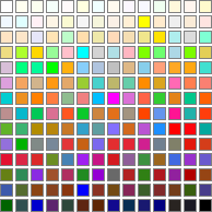
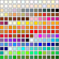
After A/B testing these alternative, grouping the colors by grayscale, browns, pinks, yellows through reds, magentas, blues, cyan and finally greens, then sorting by Relative Luminance was the preferred solution.
Color Cell Design
The color cells needed borders to indicate different things…
A single gray border was chosen as the default, neutral border.
![]() A bold compound border of black, white and gray is used to indicate the current selected color.
A bold compound border of black, white and gray is used to indicate the current selected color.
![]() A single black border is used to highlight cells during navigation.
A single black border is used to highlight cells during navigation.
Each cell needed to be big enough to easily be seen and clicked, but not so big that the overall editor took up excessive space. After testing different cells sizes, everyone agreed that 14×14 pixels was a good compromise.
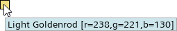
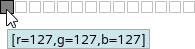
Another consideration was the RGB information for the color. It was felt that this was too much information and could be overwhelming if shown everywhere, so it was displayed along with the name in the tool tip.
Since the user can define additional custom colors, we added an additional row of up to 14 of those colors.
Other Design Considerations
Following Keyboard Accessibility Guidelines, the palette was made navigable by keyboard, and the custom color editor could be accessed by keyboard.
Outcomes and Lessons
Users found the new color palette much more intuitive. After seeing the colors all in one place, there were discussions to change the 196 colors, but it was decided to keep them as they were.
Before: Original Menu
After: Color Palette